
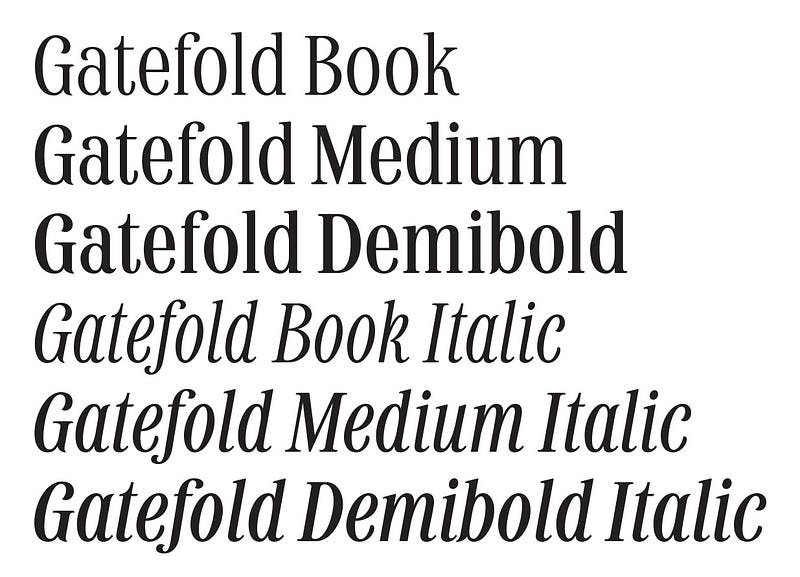
It’s a huge weight off of my shoulders to release my first typeface family, Gatefold after two long years of work. The past couple of months I have been extremely dialed-in to get this out into the world. I turned down many freelance projects to make sure I complete this sucker. Well, the day has finally come.
I want to preface this whole post with a huge thank-you. None of this would have been possible without the help, guidance, and love from many people. Without further ado, (and in no particular order) thank you to:
My classmates: Sindy Ethel, Naomi Abel, Camille Sauvé, Fred Shallcrass, Mohammad Sharaf, Douglas Hayes, Flávio Cescato, Santiago Torres, and Tien-Min Liao. My instructors: Cara di Edwardo, Andy Clymer, James Edmondson, Stéphane Elbaz, Hannes Famira, Troy Leinster, Ryan Bugden, Berton Hasebe, Christian Schwartz, Alexander Tochilovsky, Frank Grießhammer, Ken Barber, John Downer and Ben Kiel. And everyone else involved with guest critiques, feedback, guidance, and more: Daniel Morris, Jesse Ragan, Mattox Shuler, Sara Soskolne, Chester Jenkins, Dan Rhatigan, Tobias Frere-Jones, Kyle Benson, Delve Worthington, Stuart Sandler, John Giardiniere, Colin M. Ford, Mary-Catherine Pflug, Ryan Arruda, Winston Scully, Ben Jackson, Erik van Blokland, Tal Leming.
The Beginning — Learning and Understanding
Gatefold (formerly known as Warren) was born during my wonderful time in the Type@Cooper 15–16' program. Under the guidance of Christian Schwartz and Berton Hasebe, along with our TA’s, Troy Leinster and Ryan Bugden, Gatefold Demibold slowly took shape first.

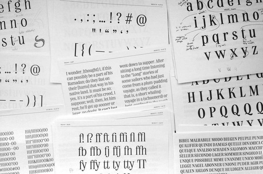
Like any project, the research phase is first and foremost. Understanding what has been done and finding reference material helped guide my vision. I came across a number of lettering books via Lettering Library and found examples of lettering that were along the lines of what I was aiming to create.
With some initial research completed, I had the general structure in the back of my head. Gatefold was drawn as part of a TypeCooker within James Edmondson’s workshop when it was insanely cold in NYC — I’ll never forget how cold it was that day walking to the Cooper Union. Moving on, I knew the brush-like terminals were the aspect I liked most about the examples I selected. I wanted to throw a brush-terminal on everything possible! The sketch was far from perfect but still allowed me to grasp weight distribution and how things might look when expanded upon.
Endless Vector Nudging
As many designers know, vectoring can be a very tedious time-consuming thing. When I first entered the Cooper program, I was very familiar with proper vectoring techniques. For some reason, I couldn’t wrap my head around vectoring things within a system. As you can see in the gif process below, it was a struggle at first. Things were pretty blobby, then sharp, and it slowly gained its voice and overall character with a bit more exploration. In each class, Christian and Berton taught me something new — my understanding of typeface design grew exponentially.
I absolutely loved going to class . Every feedback session ignited my passion and got me excited to draw new glyphs and perfect existing ones.
Experimenting with a variety of characteristics allows you to easily see what’s working and what might be best for the family. Maybe that is longer serifs, deeper joins, angled terminals, enclosed counters, etc. each iteration provided something new.
The voice was developed and it became time to build it out a bit further. Uppercase, lowercase, numerals, punctuation, and beyond. It was much easier to understand the structure of each new glyph as the overall characteristics of the typeface became defined.
Expanding the Gatefold Family
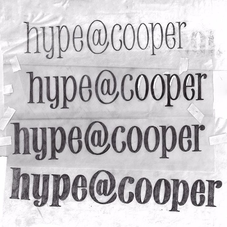
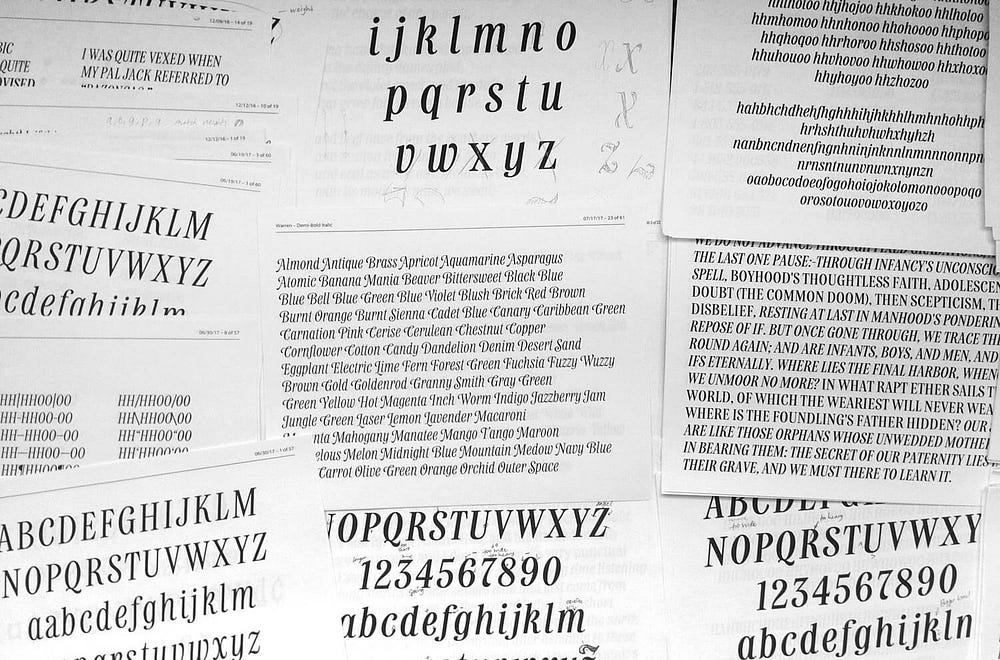
Gatefold Demibold was nearing a good place to then start the development of various other weights and styles. Additional weights made sense to expand upon, but what else could this family need, I thought. Well, of course, italic forms seemed like a no-brainer. I love how the italics turned out even though it was an incredible struggle at first. The text-weight on the other hand seemed like a hit or miss, so of course, I had to explore it further.
I felt as if I was starting over when I began drawing these italic forms. Everything I drew within my roman style was useful in some regard but every glyph had to be redrawn or corrected (more so with the lowercase forms of course). A simple slant of every glyph isn’t enough. The weighting gets thrown off and doesn’t appear like a true italic as many probably notice. The skewing of every glyph in a font family is where the term oblique comes into play. AKA oblique forms are fake italics. We don’t want fake italics here, homie.
Settling on a 10° angle felt like good middle ground. It aided readability, felt spacious, and a bit more modern compared to some of the steeper historical calligraphic forms. Additionally, you can probably see how I explored various terminals. Those endings really dictate the personality of the family and I wanted to get them just right. Too long and they appear too script-y, too short/angled and they felt out of place.
The italics were much more difficult to draw (and space for that matter). I will admit, I was pretty nervous to even begin the drawing process.
Cooper Ended, Now What?
I knew even after the Type@Cooper program ended, this typeface needed to go further. How much further? Well, if you’ve bought the family, you can probably see I went a little overboard. The family supports 200+ languages including Vietnamese…Some people (okay, many) may think, why the hell would you waste your time with that on your first release?! To that I say, hey, even if nobody uses it, at least I learned a lot during the process.
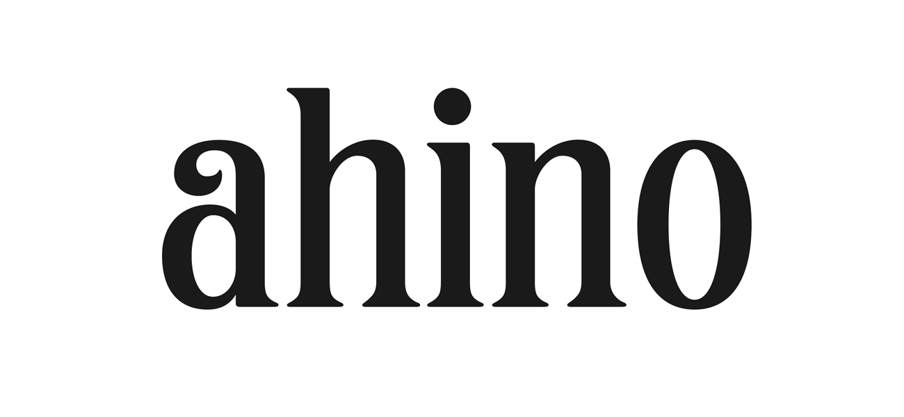
Additionally, Gatefold supports fractions, a slashed zero, ordinals, ligatures, discretionary ligatures, stylistic alternates (including the a, g, &, and №), as well as swash capitals because why the hell not!
Final Thoughts and What’s to Come
Looking back, I wish I drew the complete opposite ends of the spectrum when it came to the Gatefold family (i.e. extra black vs thin weights). To be honest, I sadly just didn’t explore them enough. With my first release, I learned more than I could have imagined and it only prepares me for the next family already in the works. As a first release, I need to understand my customers and target audience a bit better before building it out further. I certainly have plans to release a text family as well as additional display weights (should the interest be there).
Yes, I did draw a lot of things that might not be necessary on a first release… but, I hope it’s apparent how much work I put into this typeface family. I hope you enjoy it as much as I do.
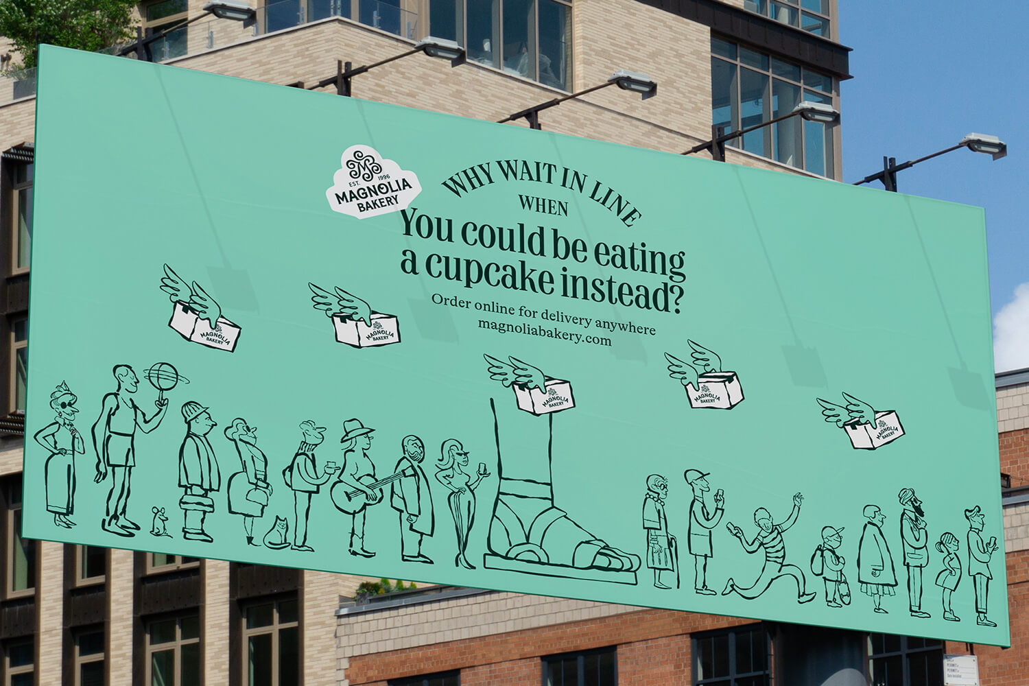
** Update from the Future (2023) **
Gatefold is now Magnolia Bakery's brand typeface?! I made a little Instagram post that encapsulated my thoughts when I saw this go live. All these years later, this typeface is getting a little love.


No Comments.