
First and foremost, this process post is in regards to a somewhat recent Fillmore-inspired project I wrapped up for Atlassian. Check it out here before reading further!
A Little Backstory...
Every once in a while, I get the chance to work on a project that is beyond exciting. The kind of project with a client that says “hey, we like you and your work. Do your thang for us”. Isn’t that the best? This here poster project for Atlassian was exactly that.
The opportunity presented itself all thanks to my friend, James that runs Ohno. Without him recommending me, I wouldn’t have been a part of it all. Shout out to James and the many others that pass along work to me when I need it most!
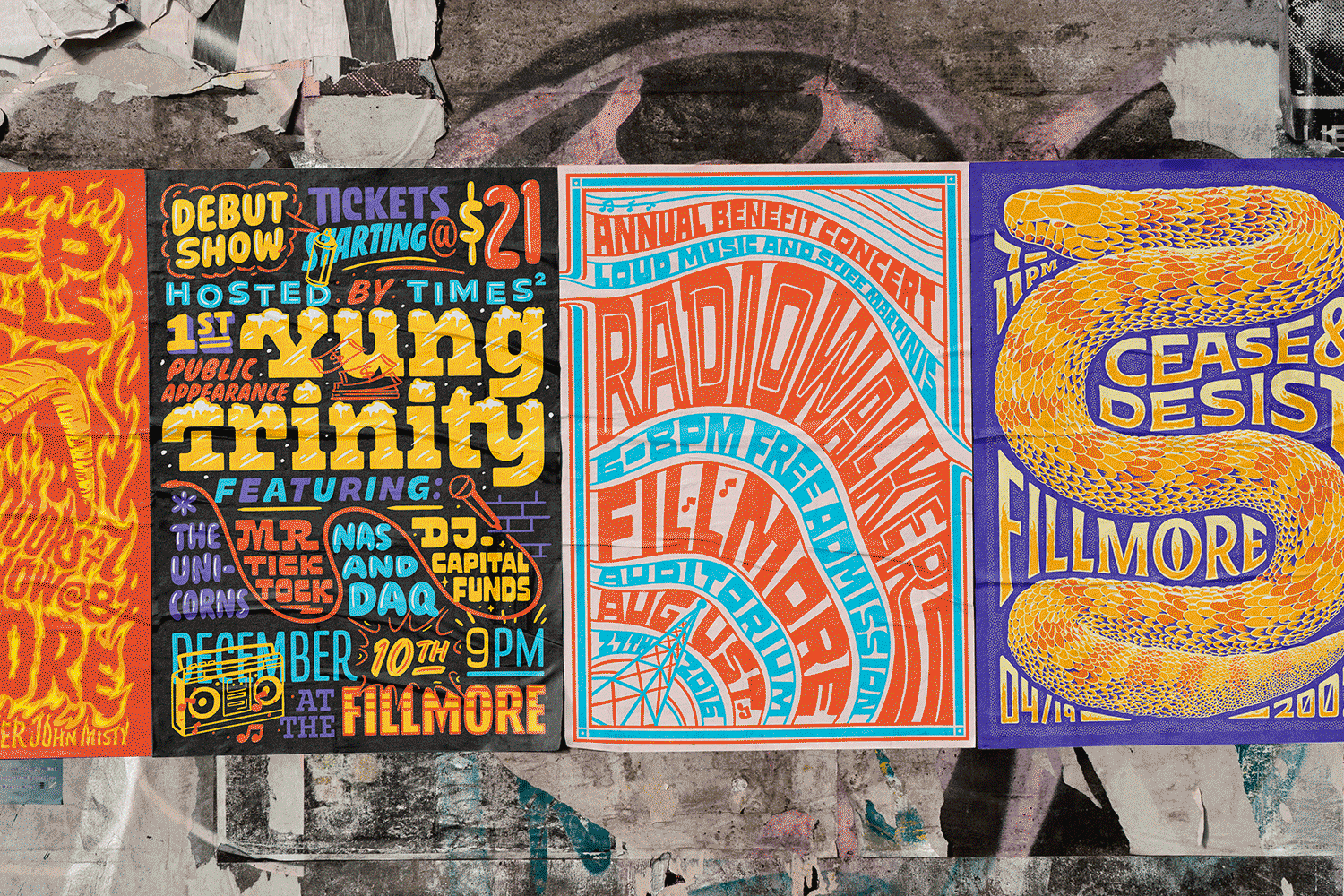
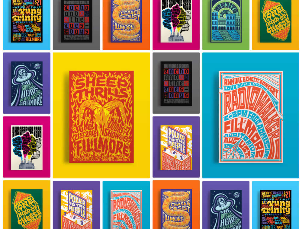
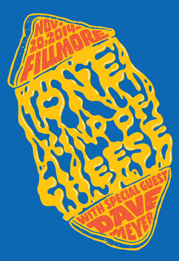
Let’s get to it. Atlassian is in the process of moving into their new HQ in San Francisco and plans to decorate their space with some wheat-pasted Fillmore posters. Intermingled with a few real posters will be a collection of Atlassian folklore stories in the form of 13"x19" Fillmore posters.
Making the Series Work.
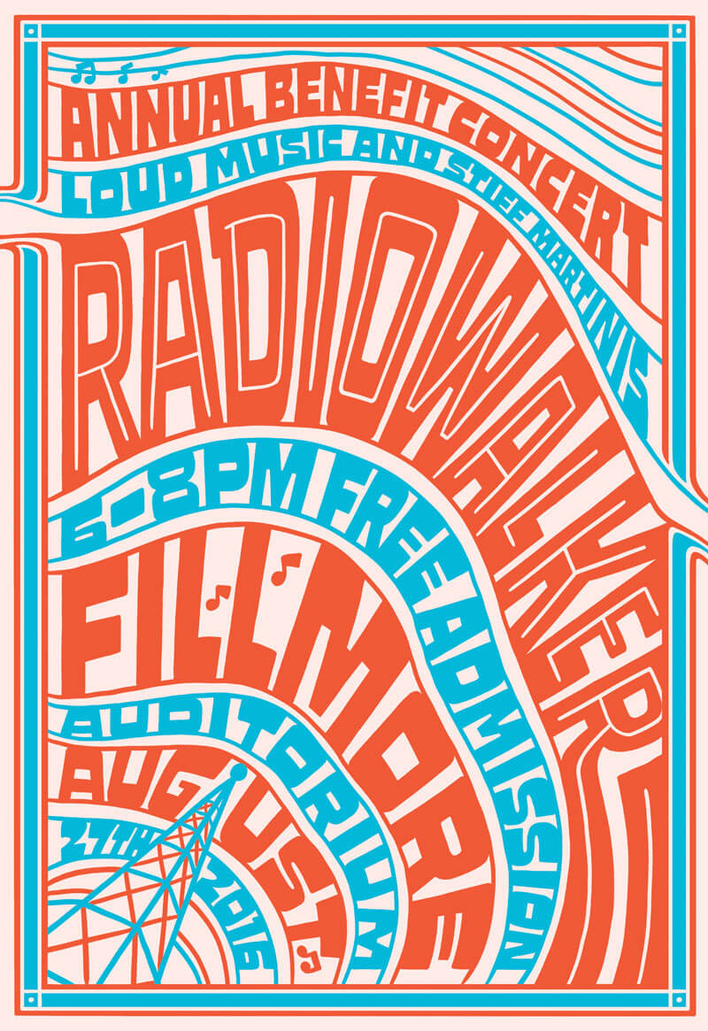
The challenge throughout this project was making sure the posters felt unique enough but still "Fillmore-y". I knew the correlation needed to be fitting type within the confines of varying shapes along with the Atlassian color palette.
The iconic Fillmore posters of the ’70s are characterized by psychedelic lettering styles as well as vibrant hues. My goal was to illustrate these posters to be reminiscent of that golden age yet modernized for the Atlassian culture. The first thing I needed to do was research and gather existing posters to understand what worked and what didn't.
Let's Get to the Process.
I was provided endless stories, rituals, and more from fellow Atlassians to help mold these posters to appear like legitimate bands coming to the Fillmore. The particular story that inspired the Sheep Thrills poster is easily a favorite.
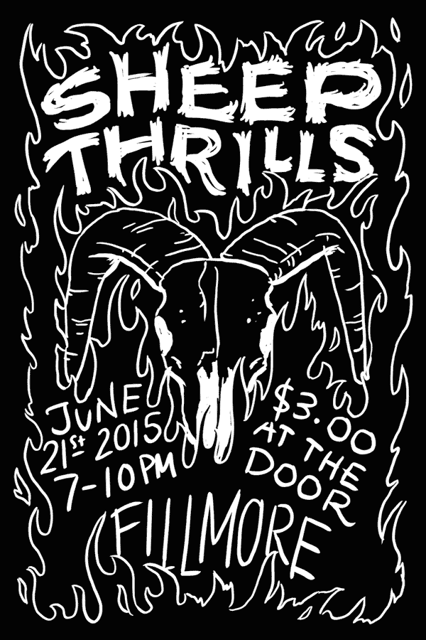
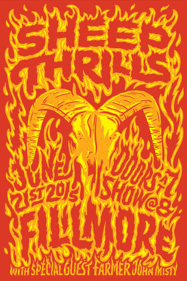
An Atlassian worked on a sheep farm for a short period of time. The sheep was supposedly not doing what he wanted to do, so he punched it. The farmer then told him, very politely, “don’t punch the sheep”. It was a no-brainer to turn that story into a heavy metal band. The imagery of a sheep skull lent itself nicely to the cause. (Listening to Bury Tomorrow while drawing this poster was a glorious time).
This poster, along with many others, was difficult to achieve that natural and organic feel. I am a bit of a perfectionist at heart but I also know the imperfections (particularly in a piece like this) make all the difference. What I mean by that is, letting some letterforms get away with being various weights, having minor spacing issues, crazy constructions, etc. it was a challenge to find the right balance. I conjured up some gesture drawing techniques and just let my hand flow through the motions.
A Tribute to Jeffrey.
I don't want to bore you with the process of each and every poster I illustrated but I can't pass up the chance to share another favorite in the series. Jeffrey Walker was Atlassian’s first president, who sadly passed away in 2009 from cancer. He had a profound impact on the culture of Atlassian as a whole but especially the SF office.
Something bold and impactful was the goal for this poster. A poster that would ideally last the test of time. A poster found in a vintage store decades later and still purchase with no knowledge of the band, you know? I wanted to pay tribute to Jeffrey, his blog, and the legacy he left behind with a type-focused tribute poster.
Black & White First. Make it Work. Then Add the Color.
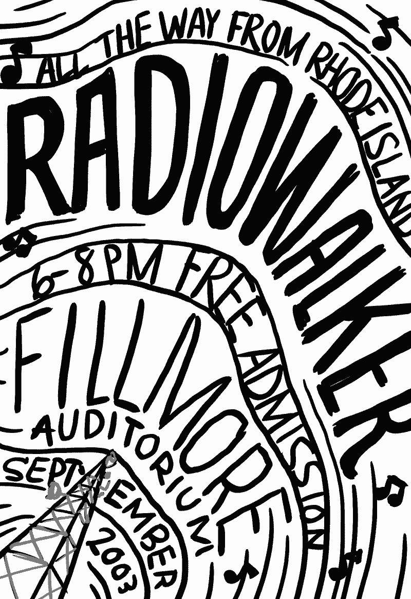
All of the posters began in the roughest state. A small, quickly drawn sketch to send along for the client to understand the overall concept, composition, and direction each poster would take. Working solely with black and white makes the refinement process easier. I work on illustrations similar to type design – balancing positive and negative space. Furthermore, I am “painting” (using a Photoshop brush) with black to create the forms. Then, "painting" with white if I need to “erase” or remove certain areas. Rather than bouncing back and forth between the brush tool and eraser tool, painting with black and white makes it a simpler, faster approach.
“Sometimes I Think Shit Just Looks Cool”
I want to end this post on the notion stated above that was said by Gabe Imlay in Wonderland (the greatest short film I constantly watch and rewatch over the years to get inspired). This project in particular was inspired by various stories and rituals but at the same time, it was a creatively fulfilling project to feed the soul. A project that allowed me to express myself, draw things I rarely get the opportunity to draw, and explore that process along the way. The SF Atlassian team had faith in me to deliver a badass end product and I truly believe I delivered. Thank you, Atlassian.


No Comments.