Two years ago, at the start of 2018, I drew a custom blackletter-inspired logotype for myself to utilize on my portfolio site. I continued drawing and documenting the process of other logotypes for clients to see the variety of styles I am capable of. This blackletter stencil logotype became an instant favorite from the collection and there it lived on my site. Later on, in April of 2018, Andrew from True Grit Texture Supply reached out about developing an exclusive "True Grit" typeface. Needless to say, I took this project on in an instant!
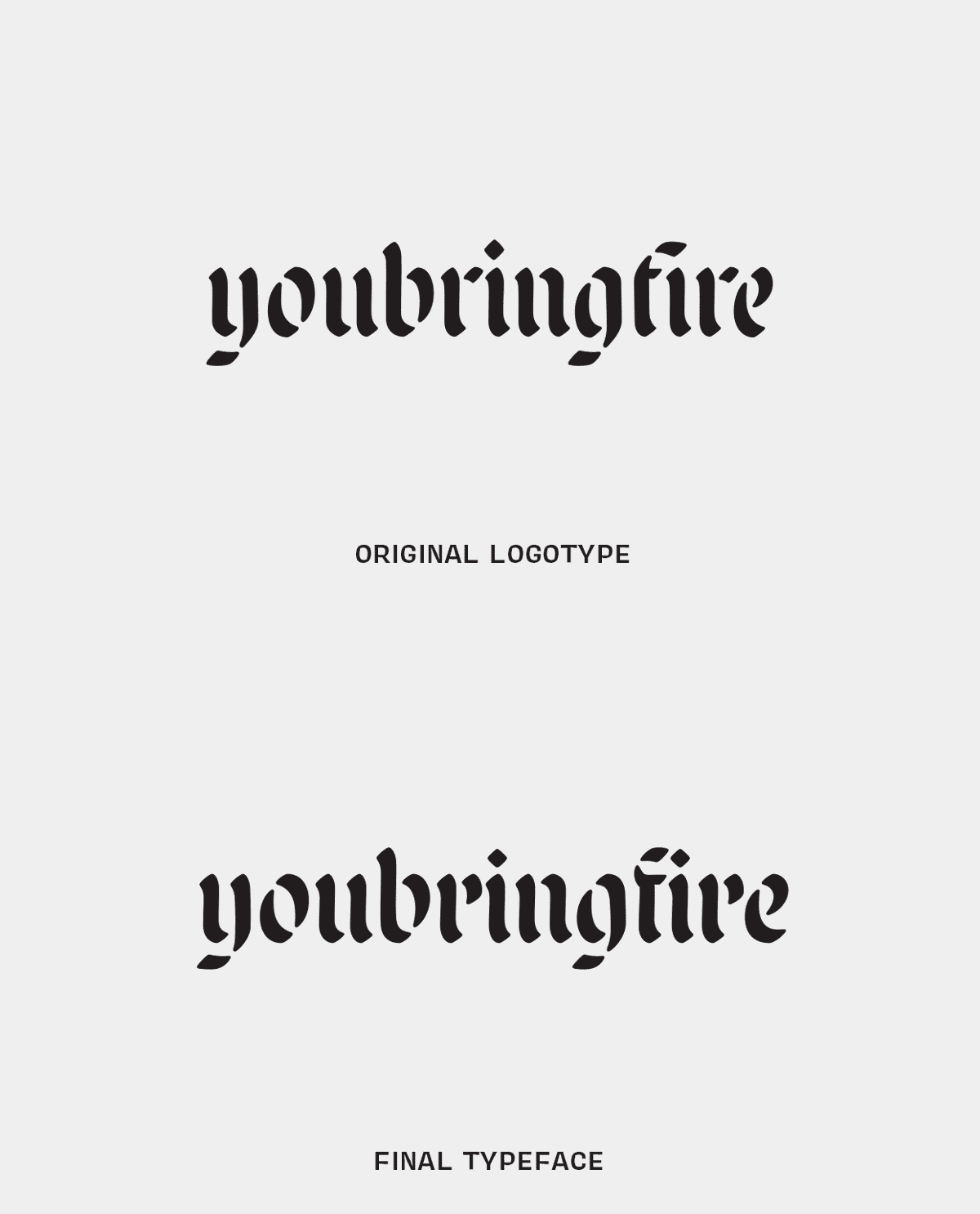
Looking back, this typeface actually began in 2015 while I was undergoing the Extended Type@Cooper program. We explored humanist forms while drawing with a parallel pen. I began drawing large forms with a Copic Wide marker. That tool helped guide the overall look and feel of this typeface.
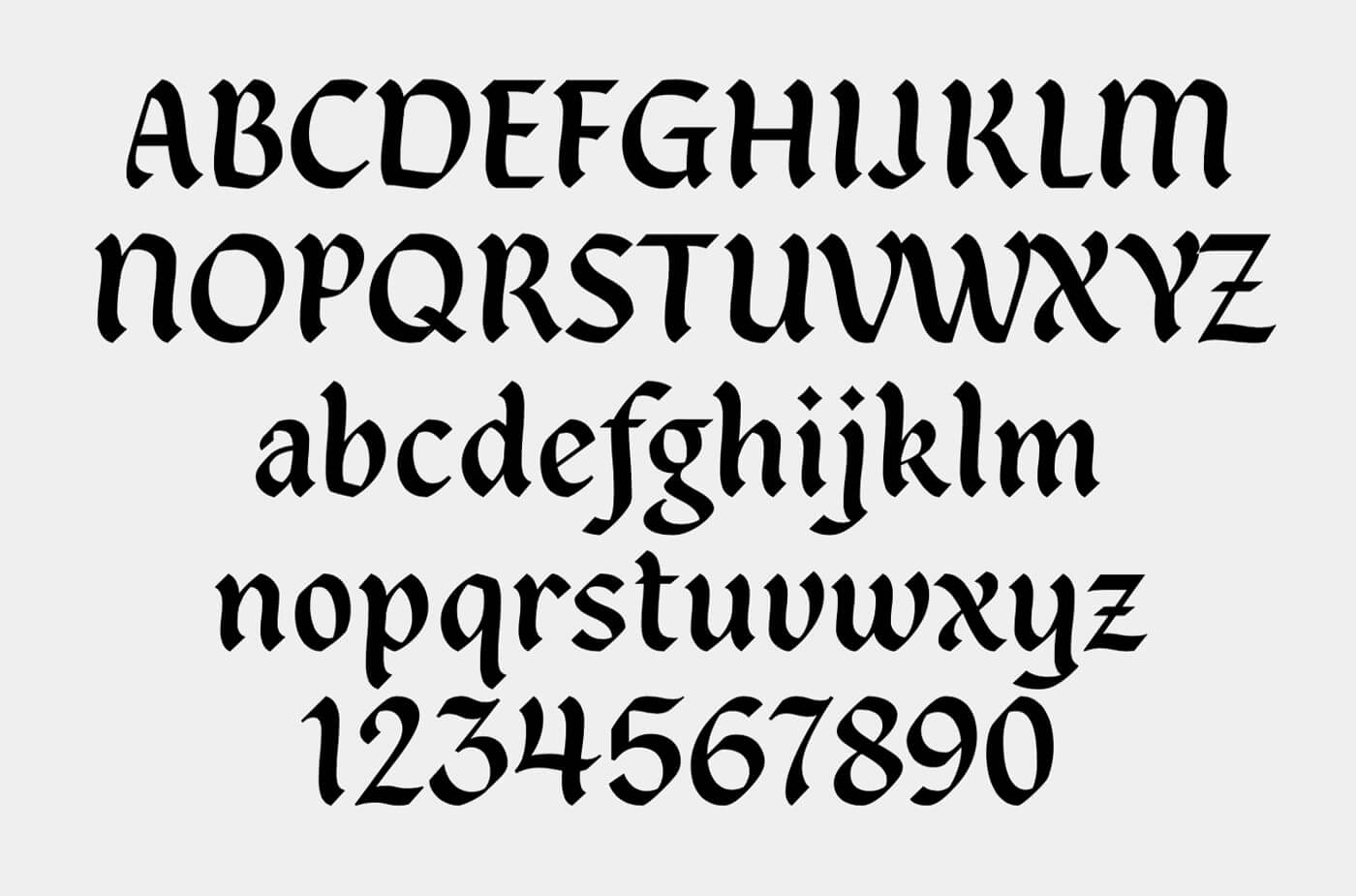
The wavy nature of the vertical stems was the one characteristic I kept as I continued onward revising this type. The process followed the typical motion of forming serifs when calligraphing, so this felt very natural and created an interesting effect. That undulating motion sure was a pain with certain glyphs, but I'll get into that later. The goal of Malice was to create something very true to the pen/brush and the motions of my (left-handed) calligraphy.
As Always, My Process Begins on Paper
Since I have a hard time iterating digitally, nearly every project I start begins on a piece of paper. Most of the time, that consists of quick and rough sketches to get the idea out of my head into something more tangible. It's a quick method of exploring what's working well and what may cause problems down the line. The early process of Malice Stencil was mostly calligraphed with a Zig calligraphy marker because of the nature of the forms and how quickly I could iterate in my tiny sketchbook.
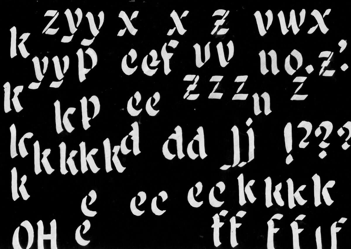
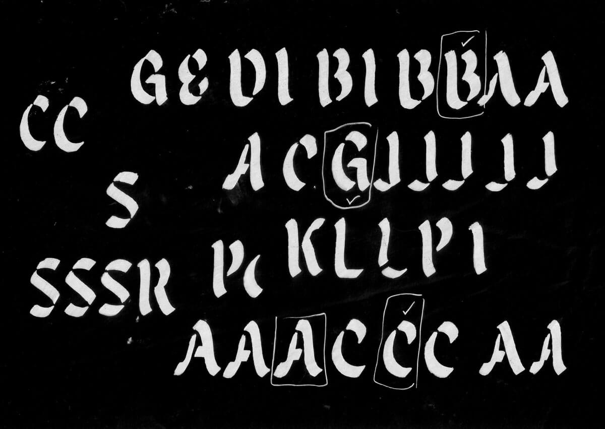
As I continued drawing, I learned how each letterform needed to be slightly tweaked in order to look and function properly. Like many things in type design, what I discovered is the exact same stencil pieces could not be copied / pasted throughout. The stencil pieces appear quite similar when not concentrating on them, but most characters are unique to themselves and their construction. Each glyph needed subtle edits to nail down the correct letterform width. This, in turn, helped the letterforms posture feel more upright and created a subtle nod to how the same personality occurs within calligraphy.
Reaching Out for Feedback
Thankfully, the deadline for this typeface kept getting pushed which allowed me time to take a step back from this project. I didn't touch Malice for a good month or two at one point. This break was crucial to help improve the overall design as I began to notice things I didn't before.
Pushing onward, I reached many points where certain characters or decisions left me stuck. When I noticed myself getting frustrated, I knew it was time to reach out for help. Friends like James Edmondson, Andy Clymer and many others across social media provided thoughtful feedback to remove my roadblocks and present a new perspective.
With that said, let's talk about (some) of the darn problems I encountered! Nearly all of the capital letterforms gave me grief. Most importantly, the E, F and T drove me nuts. Those forms constantly felt out of place and disrupted the overall texture. Early on, those characters weren't stencil-y enough...then, evolved into something very forced. The day I solved those characters was a glorious day.
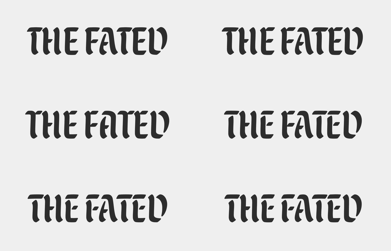
Of course, the process of the M and N sure gave me hell. I wanted to approach those caps with a little more thought rather than repurposing the lowercase "m" and "n" that is seen in some blackletter families.
Time Away to See the Unseen
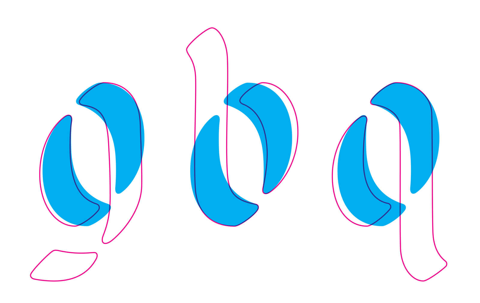
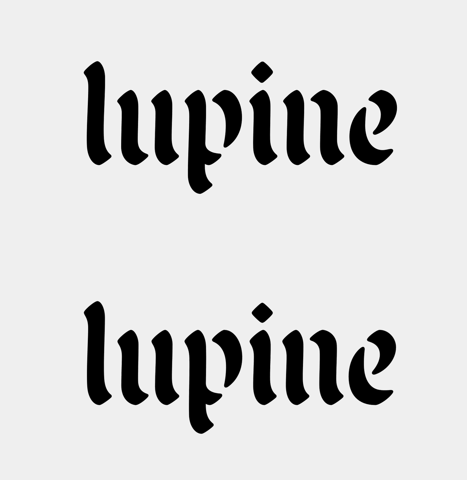
I hit pause on Malice Stencil for a few weeks as I took a little type design sabbatical in Paris over the summer. That little break really helped clear my head for things to come. The one major design flaw I noticed was the entry strokes among many lowercase forms — they felt too sharp and too light in weight. This posed a decent amount of reworking since it occurred across so many characters. It's something so minuscule but obviously makes all the difference when you see the before and after. Pay attention to those entry strokes in the below image.
Another optical flaw I was noticed across many glyphs was a strange tilting/rotating effect. You can see that happening in the "p" below. So many characters were either falling forward or leaning backward...I never noticed this up until I returned from Paris! I'm glad I caught it early on because yet again, those slight edits make all the difference in the end.
“Malice is a Dark Name for a Typeface”
You bet your sweet booty Malice is a dark name! For those of you that know me, I certainly have an obsession with darker imagery — skeletons, flames, occult stuff, you know, the usual. During the typeface production, I constantly jammed one of my favorite bands, Bad Omens. Well, their song Malice inspired the lineup of fun "evil" emojis. While I had a lengthy list of other potential names, this culmination of facets lead to the perfect name.
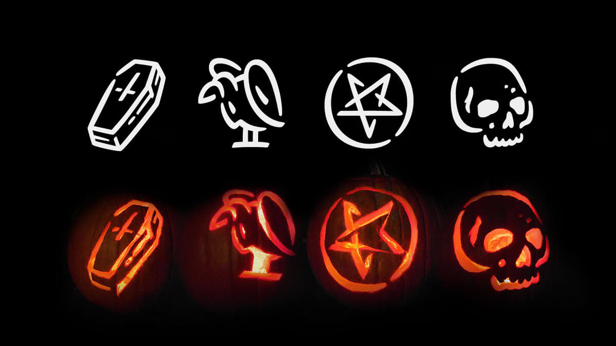
P.S. the stencil emojis were also drawn initially on paper with the same Zig Calligraphy marker to help them feel more cohesive with the typeface.
The Nuance of a Textured Typeface
As with everything Andrew offers on the True Grit site, this typeface needed a textured companion. I contemplated the easiest way to get this done effectively and efficiently without an insane amount of tedious production work. Here was my thought process: export the clean typeface, open every glyph in Illustrator to texture, somehow import it back into Robofont (but maintain the same scale and positioning so the spacing, kerning, etc. remained identical). Easy right? Not for me! I knew some kind of custom python script could potentially save me time...the issue was, I have very very little knowledge of this realm still.
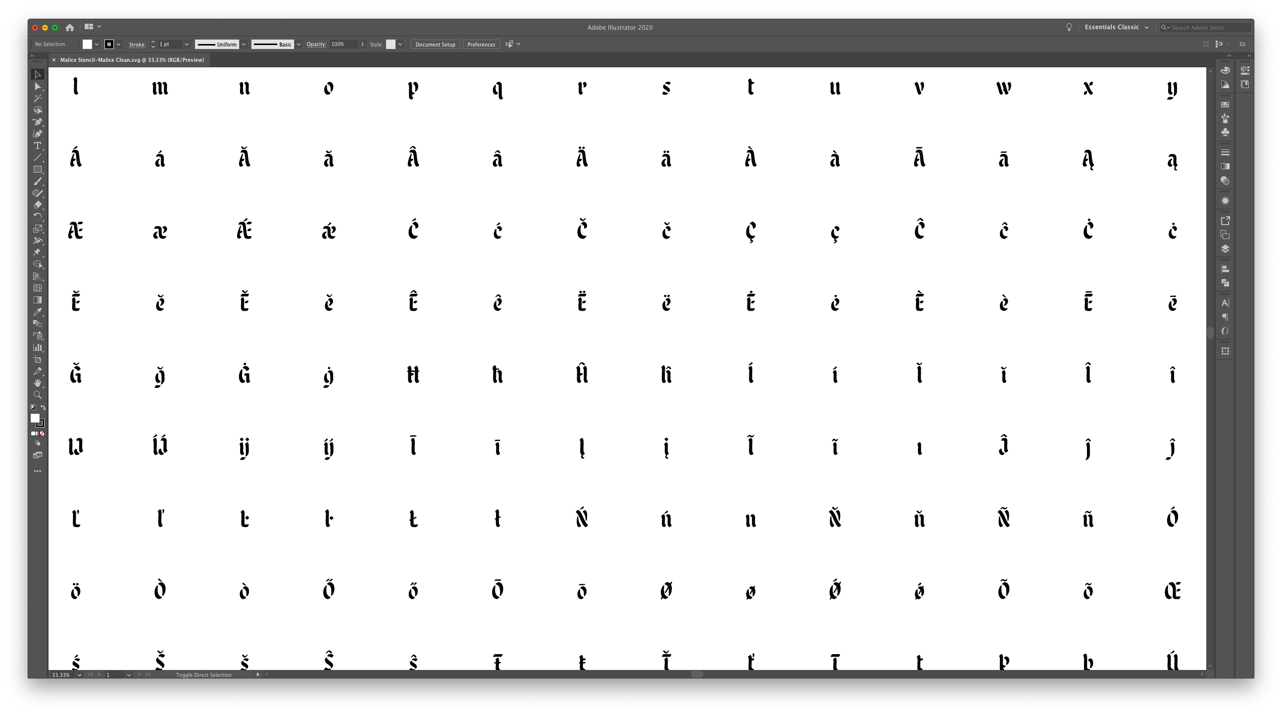
In comes Andy Clymer again! An email was sent off to inquire about the cost of creating such a script...Andy was incredibly generous to lend his time to create an entire functioning extension for Robofont. This beautiful extension allows a user to export the entire glyph set gridded out as a large SVG image. That SVG was then sent off to Andrew for the texturing wizard to work his magic. Once he was done texturing within Illustrator, I utilized Andy's extension to then import this new "textured" style back into Robofont while maintaining the same spacing and positioning! Voilà! A freakin' masterpiece when I witnessed this work.
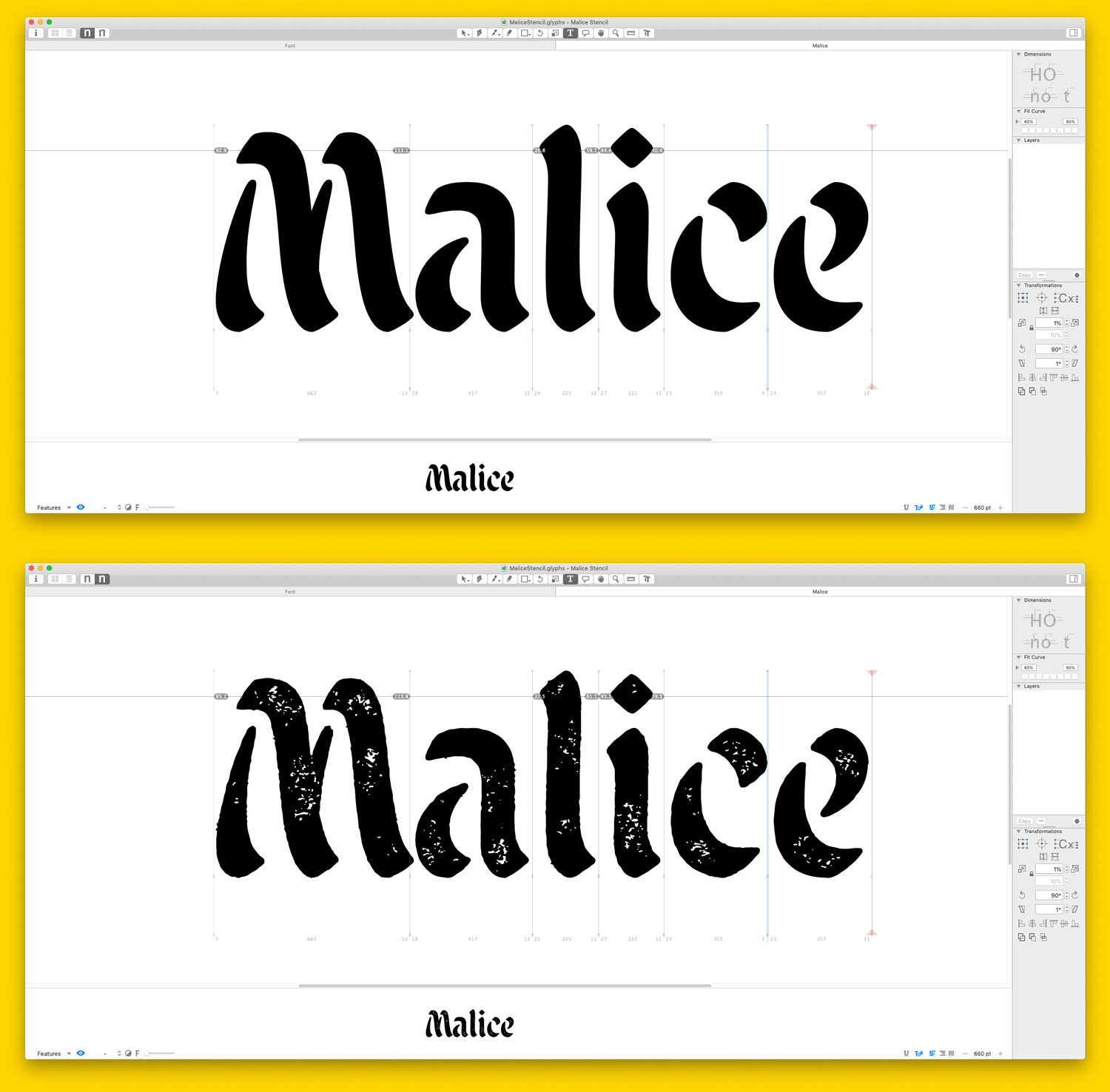
While I still had to complete minor clean-up work (textured typefaces sure have a ton of anchor points), Andy's extension saved me an immense amount of production work. And that, kids, is the importance of learning code. Highly recommend.
A Few More Thank You's
I'll try to keep this brief! A massive thank you to Matthew Smith for helping with additional production work on this. He's the reason everything functions so nicely — especially those beautiful emojis. Can't thank that dude enough. Thanks to the True Grit team for hiring me to push myself into an unknown territory and having faith in me and what I can deliver. Thanks to the many folks that tested Malice out before the official launch. Your thoughts and feedback helped immensely.

No Comments.